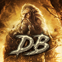
Ari Posted November 17, 2009 Posted November 17, 2009 1. [IMG]http://i33.tinypic.com/28wp4jq.gif[/img] 2. [IMG]http://i35.tinypic.com/300403c.gif[/img] 3. [IMG]http://i35.tinypic.com/30jmr5z.png[/img] 4. [IMG]http://i35.tinypic.com/116q1b8.gif[/img] 5. [IMG]http://i36.tinypic.com/16c0v9g.gif[/img]
To Idolize Posted November 17, 2009 Posted November 17, 2009 My favorite would be the fifth one. The color choices are poor and the first two (animated ones) give me a headache. Also try on working on better color choice/applying gradient maps and blend the light source in more so it's not as bright.
Idiot_Wasabi Posted November 17, 2009 Posted November 17, 2009 the first 2 are fuxing up my eyes, 2 much movement 2 fast. soz. the 5th one is my favourite as it has something in it rather than a few random people just standing around, but as idolize said; blending the light source would be much better. my opinion might not count for much as im still learning :p
To Idolize Posted November 17, 2009 Posted November 17, 2009 2nd sig has parkinsons :( Lol, at least he's experimenting. :nice:
Ethan|Unicornz Posted November 17, 2009 Posted November 17, 2009 2nd sig has parkinsons :( win. i agree though, animations are a bit too fast. you're doing well though, keep trying :)

Recommended Posts
Create an account or sign in to comment
You need to be a member in order to leave a comment
Create an account
Sign up for a new account in our community. It's easy!
Register a new accountSign in
Already have an account? Sign in here.
Sign In Now